


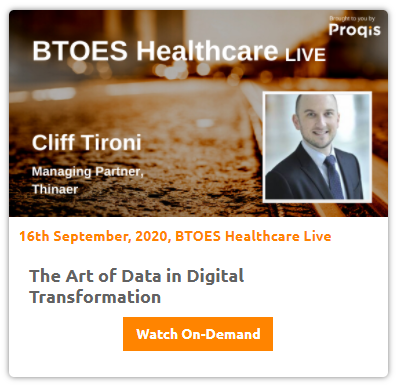
Courtesy of Thinaer's Cliff Tironi, below is a transcript of his speaking session on 'The Art of Data in Digital Transformation' to Build a Thriving Enterprise that took place at BTOES Healthcare Live - A Virtual Conference.
.png?width=300&name=Sponsor%20Image%20(20).png)

Session Information:
The Art of Data in Digital Transformation
We often think of data visualization as a tool that describes what happened. However, it also tells a story that can guide the future. Use it to uncover hidden problems, redefine those problems, and craft solutions for growth. Join us for this interactive session which will help you find the possibilities in your data. The audience will experience a case study that focuses on a process improvement project for a major healthcare provider.
This session will review how storytelling through data visualization led senior-level hospital administrators to gain a more holistic understanding of the operation’s true problem, and what was needed to remedy it. The audience will also learn how to create patient-centric empathy in data-driven presentations. (Bonus: the tools used in this case study are accessible to all business professionals, making the content that much more relatable to the audience.) Lastly, attendees will be able to chart their own path for growth using a free, interactive digital transformation tool.
Attendees will receive the following benefits:
Session Transcript:
Now, without further ado, let's welcome our first guests of the day. We have Cliff to roni you with us, Clift Rani is a managing partner of thing. There is a co-creator of the real-time feedback platform used as a core tool, utilized and driving their digital transformation consulting.
Cliff has a passion for data visualization, as a method to uncover deeper meaning and powerful insights, Cliff, very excited to have you here with us, and very much looking forward to our presentation.
Thank you, Josey, I appreciate it.
Let me go ahead and share my screen.
Looks good.
Fantastic, thank you. Um, so, welcome, everybody, and thank you so much, for joining this morning, and just say thank you for your partnership, and that was a fantastic introduction. It sounds like a really, really exciting day.
So, I'm excited to kick things off here with a presentation around the art of data in digital transformation, and we're going to be talking about how you can use data visualization as a method to uncover hidden problems and, as a result, create innovative solutions to complex challenges. So, I'm pretty excited. A little bit about who we are, and then we'll dig right into the content. So, this is an example of a visualization that we created recently for a Fortune 100 consumer package goods company. I'm not going to dive into all of this, but the point here is that you can use visualizations. You know, we often think of them as deliverable. You can also use them as a message. And so here what you're seeing without unpacking all of this, we helped this firm to deconstruct and repackage their entire stage gate process. And these are a bunch of visualizations that were created to help craft that story.
What we're gonna be covering later on this morning, in just a few minutes here, is how this actually applies to healthcare. And I'm gonna walk you through, step by step how you can use some of these frameworks and tools in your own practices. Josie already introduced me. I appreciate the warm introduction. I am a self proclaimed data geek at heart. I have a background in data visualization. And I very much enjoy how data visualization can be used as a powerful method to write to uncover business problems.
 Sydney Air, the company. We have a range of solutions. We have IOT sensors that can measure just about anything. They can be tagged on your most important equipment like machinery. And then we also have a real-time feedback platform. And so the combination of the IOT sensors with human based feedback gives a complete 360 degree view of a company's operations. And we then wrap that all up with some high powered analytics and change management consulting.
So this year is an example of how this might actually work in your facility.
I know many people here are in healthcare where in number one there, you're seeing this patient was first head of infection in room 108 B and I know that role really trying to address the challenges associated with ... and contact tracing. And so, here, imagine a patient did have an infection. In step two you see the physician is recognizing that there's a need for cleaning and disinfection and that has to be a priority. And so, she's using the real-time feedback platform to collect feedback from the team on ways that processes and operations can actually be improved to address it. In the upper, right-hand side, there, in Step three, you can see that this cart was moved from Room 100 and be where that infected patient was. So, that's where you could use sensors and track your assets and see where they've moved from and to And then, in step for this administrator clearly sees that there's issues around disinfection people are returning devices assuming they've been disinfected when. In fact, they haven't.
In Step five on the left, this is where the analytics comes in and having the ability to have that insight into your operations and decreasing the risks of healthcare associated infections, HAI, ....
And here, we're seeing that the equipment was actually moved from one room to the other and therefore requires disinfection, Then in step 6 and 7, real-time alerts are going out about proper hand hygiene practices and sanitation stations to be refilled. So, this is sort of a landscape of how you can think about some of the components of machine and human based feedback and digital transformation, who you are, are a mix of business professionals, Some of you are in health care, and some of you are right. It's a global audience, and So, my commitment to you coming out of this session is that whether you're in the very beginning stages of your digital transformation journey, whether you're towards the end, whether you're a novice and data visualization or an expert that, each and every one of you is going to get something out of the next 25, 30 minutes. So, that's quite clearly to you.
This was created specifically with you in mind, and we're going to have some fun doing this. We're going to go over a framework of a conceptual hierarchy. We're then going to talk about redefining the business problems. Specifically, then, we're going to walk through how this is applied to help a a large medical provider with a really sticky problem around patient throughput. We're then going to show how that applies to your own digital transformation journey. And then, we'll wrap up with a Q and A. portion, and I'll take any questions from the audience.
So let's dive into the content here.
This is a framework and, you know, when you think about visualizing data, really what you're doing is encoding information, All right? You're taking it from one form, and you're converting it into another form.
one framework that you can use to think about, this is this conceptual hierarchy here.
 Every concept that has existed, that does exist that will exist, exists on this continuum of either being very, very concrete, or very, very abstract, and the degree to which that concept falls on this continuum, is contingent upon how immediately removed it is from your immediate span of view.
So for example, if I say the word chair, which is a really concrete concept, you get what's called an immediate perceptual reference, which is really just a fancy way of saying, you know what a chair looks like.
And so, you may not have thought of this chair in particular, the one that I'm showing on my screen, you may have thought of one that has mental backing, or maybe a different seat color rather than vanilla, and maybe it was great.
But, you know what the Chair it looks like. And so, when I said that concept, you get an image of that, it comes pretty quickly to mind. Now, if we go up that hierarchy, and, I say something much more abstract, like, furniture.
The range of possible inputs starts to expand infinitely in your mind.
And so, you start thinking of things like tables and sofas and chairs and plants.
And so, the ambiguity and the room for interpretation increases. The more abstract that we got on that conceptual hierarchy continuum, and this has dramatic implications for when you apply this to things like patient throughput analysis or contact tracing. And so we're gonna break that down in just a minute. Let me give you another example.
If I say the word kiss, you may have thought of kissing a loved one spouse or a son or a daughter this morning before hopping on today's sessions. If you're a music fan, perhaps you thought of the rock band. And if you're a chocolate fan, you might even thought of the tasty treats. If we want to continue, when I say the word loves, the range of possible input starts expanding infinitely. And again, there's way more that we would be able to show here in just a few minutes when we think of, what does love actually mean visually, and how would we encode that?
So when we encode information, and similarly with data visualization, we're dooming so taking concepts, and then converting them, using symbols, shapes, and colors. And you can use that hierarchy as one framework, which we'll go over, how we actually apply that to a patient throughput analysis in just a minute.
Before I dive into that, the other core piece of this is truly understanding your business problems.
And, that's at the heart of everything, right? Because you can create a very innovative solution, but to a problem that was defined inaccurately. That solution is expensive and feudal and it doesn't make sense. And you just spend a lot of time and money on it.
I'm gonna give you a very, very fun, sort of basic example of how, in our everyday lives, we, all, as humans are confronted with having to, not only to find but redefine problems in everyday interactions that we have.
We're then going to take that concept and then apply that to this patient throughput Analysis, and so, the everyday example that I have for you is about Peano, my cat.
For years, my wife and I fought over, or getting a cat, and I was always a dog person and I never wanted a cat.
We fought and fought and fought, and one day, after we got married, my wife goes to the shelter to get a rescue kit.
And she sends me this text message and she says, Hey, I'm at the shelter or getting this a kit. And I write back, are you serious?
And she writes back, she thinks she's funny he or she says, seriously fuzzy. Yes, I'm serious.
And so I, my blood pressure starts increase. I start getting upset. And I write her this long text message back saying, I can't believe this. You know, I'm so upset.
If you get this cat, you're going to have to feed it. Clean it, take it to the that, right? All these things.
So mad right now, she writes back, photo with the contract signed and the cat to peano's coming home.
So, I go to blow off steam. I go out for a drink with my buddy, And I come back, and, and within about 15 minutes, after seeing this little guy, my heart and outs.
And so, before I know, and I started cooking food for ..., cooking and chicken, or hanging out, we're becoming best friends and wanting to know which a piano even enjoys reading about data visualization. So here he's, he and I are learning up on aspect ratios for a properly designed data visualizations.
So why am I telling you this story?
Because one night, this is a few years ago, I was having bad back problems and tobacco spacing. And we get this £60 bag of litter. That's delivered to our apartment, and my wife was nagging me to change to peanuts litter. And so I was like, now, I can't, you know, my back hurts, I don't want to spell litter everywhere.
And I started rattling off all these different problems.
And she stops and she says, None of those are the problem.
She goes the real problem is getting litter in the litter and so she walks over to the kitchen. She goes to the to the camp to the cupboard and she pulls out one of those to go containers that you get from like, from a restaurant.
She walks over to the £60 bag of litter and plops it in and she goes, their problem solved.
And I stopped in my tracks and I thought, You know what?
She's right.
The problem wasn't that I was going to hurt my back. The problem wasn't that litter was in the store where the problem was getting litter in the litter.
And so my wife and came up with a creative solution to an everyday problem. But I thought that was a really great example of how, in our everyday lives, we are confronted with thinking about things as problems.
And then, we create what we think our solutions around those problems where, as we really have to take a step back, redefine that.
And then, the solutions that we create, not only are more creative, but sometimes they actually work far better.
They do work better because you, you've defined your problem accurately.
So, I want to now take that same. I hope you enjoy that story.
I now want to apply that same concept here to a large health system, that we help them to redefine their problem, and then we're going to go back to that conceptual hierarchy as well.
 So this was a on a patient throughput analysis, and the executives at this particular facility, they were convinced that they had a space problem.
And so, they wanted to knock down all these different laws. They had patients that were getting lost, they had equipment out in the hallways. And they said, we want to knock down that wall, that will, that wall, we have space.
And so we said, OK, you know, we'll take a look at the data, collect some information, and we'll do interviews, And we'll use our approach to how we might solve this highly abstract concept of a patient throughput analysis for this large medical system.
And so, the first analysis that we did was we wanted to take a look at the spread of physicians schedules, and so, here, you're seeing gray bars, and those gray bars represent the spread of one physician schedule for this particular week.
And so, physicians were scheduled to see patients in four hour chunks.
You could either see patients between eight AM and 12 PM, or between 1 0 PM and 5 0 PM, And so, at first, I said, You know what, I don't care when they saw them. I just wanted to know what was the spread of when each physician saw their first patient. And when they saw their last patient, not accounting for this visual, all the individual appointments in between, to look at some of their space. And so, we found that, on average, physicians were seeing patients over a 2.5 hour time period.
So out of a four hour allotment that meant, they had about an hour and a half of an optimized space and time. And we thought, OK, maybe there's something there. Let's dig a little bit deeper.
And so next, then, visualized in Excel, what this would look like if this facility were operating at max capacity.
So, this is a visual rendering of what it would look like if they were operating at max capacity, where you would have a provider, right, as a physician, and every physician was assigned to two different rooms.
And so, ideally, what would happen is, a physician would come in, see their first patient in the morning.
Meanwhile, a second patient was coming through check in and triage, and then making their way to the, to the room across the hall. And me, as the physician, I would literally go back and forth, whether I was seeing new patients or return patients. Because they were scheduled either in 20 or 40 minute blocks.
Back to back to back all day, as would my eight other colleagues across the 16 visitation brooms.
And so this is what was, would happen if they were operating at max capacity.
In reality, we found this, look at all this craziness that's going on here. There was tons of unnecessary whitespace. There was double and triple bookings and it literally was just chaos every day of the week. You're only seeing this 4 for 1 day. And so we thought, all right, maybe there's something there. Let's dig down even further.
So, we next wanted to visualize what it looked like as patients move through this process. And so, I took the blueprint of the facility embedded in Excel, and then here, you're seeing 740 in the morning.
And you're seeing a room that's highlighted and that represents a patient being seen.
And so as I start to scroll over for different time slots, you're literally going to see patients start to move through and you're gonna see the double bookings, the triple bookings. And that's for, not just Monday, That's for Tuesday, right, every day of the week. It's the same exact data I presented before. It's just visually expressed a little bit differently.
And so when we presented this to the executives, they had their own light bulb moment. And they said, oh my gosh, we don't have space problem.
We have a scheduling problem.
And we said exactly right?
So we then gave them solutions around their scheduling, not around their space and they saved a lot of money with not having to tear down walls. And we focused more so on the business operations side of things, not on deconstructing the actual fiscal space of the environment.
And so going back to this whole notion of the conceptual hierarchy for one of the things that you can do, your job is feels completely free to present the same data. but through different forms. It can be very effective.
The other thing, going back to our, our hierarchy of abstract and concrete, is, I could have walked in, and when we delivered the findings to the executives, I could have said, all right, your room utilization is 65%.
.png?width=742&name=Screenshot%20(4).png) And we tend to think of numbers as being really, really concrete, But in reality, they're really abstract because they represent something. In this case, it represents behavior.
And we tend to think of numbers as being really, really concrete, But in reality, they're really abstract because they represent something. In this case, it represents behavior.
So I liken that to the water cycle.
Where I'm at, on the water cycle, it's almost like water vapor. It's really hard to see. It's really hard to feel that it's really hard to visualize. So we started breaking it down, hierarchically.
The next level down was when we showed them the gray bars and that was, like, water beats warming.
The next level down from that was showing them the blue bricks of the schedule, and that's like actual water.
Then even more concretely we showed them what it looks like as patients move through, and that's like ice. The next level down would be for me to take my phone or some recording equipment, and record patients for eight hours as they're moving through this process. one that's a little creepy to, that's impossible to go, and then discern any kind of pattern from, and then present, right? No one's going to sit down and watch eight hours of you, following patients around, you have to visually encoded. And so what we did was, we started on this continuum concrete. We went all the way through to walk the executives through to redefine this problem for them.
The other key piece of this is that you can use data visualization to create empathy, and to understand the human context now, we often think of data as being, like, cold and ruthless. But you actually can use it as a powerful way to create empathy.
And for us, when we walked in to deliver the findings for this presentation, we knew that the stakeholders in the room were a mix of them.
And so was executives, it was scheduling staff, it was nursing staff, and there are about 25 or so people in the room. Now, whenever people hire consultants with technology like us to come in, there, tend to sometimes be a little bit on edge, because they don't know always what the findings, or if they're fearful for getting their wrist, slapped, or losing their jobs, right? This wasn't the case at all.
But we recognize that, and we create a lot of empathy and when we deliver content and so we want it to neutralize any feelings whatsoever of negative sentiment.
And without even showing the first piece of data, we wanted to show what it looks like as patients move through this process to create that common sense of empathy throughout the room.
And so here, this is the same blueprint that I showed you before We put in one slide and PowerPoint, and as I advance the slide, you're gonna see that we want to show that a patient walks in.
They have to check in.
And when they check in, they interact the scheduling staff that file some forms.
They then move through and go to the waiting room, right? After they go to the waiting room, there for a period of time, they then are triaged and they interact with the nursing staff.
Alright? And we literally walk people through to remind them that this is more than just a scheduling problem, let's look at it in terms of every step of the sequence that a patient goes through your facility on a day-to-day basis.
So this was a great way to sort of set the stage and remind people, and also, that this isn't just a scheduling problems, is a human problem. And looking at these components in context, visual is really, really helpful. And by the way, this was done using just one slide and PowerPoint. So this is how you can use tools in your every day, that you have access to every day in really creative ways, as opposed to doing like a bunch of bullet points.
So just think of the power of how you can use data visualization and with every day tools to do this type of analysis, just like we did. And just remember to accurately define your problem, show data through a variety of lenses, and create empathy, and don't always assume that your audience, whether you're an internal or an external to a client, has defined the problem accurately.
Don't use just abstract numbers. Show it visually as much as you can, and, of course, don't be emotionally removed from your stakeholders, immerse yourself. And what they're thinking. And then present that. The last example that I want to give you here is, and then we're gonna go over to giving you a strategy and a framework for how you can use digital transformation at your companies.
This is a really powerful example of data, visualization that in World War two researchers at the Center for Naval Analysis, were confronted with a really difficult problem.
Because these bomber planes, the United States Bomber planes were returning, and they had all these bullet holes in them from trying to be shot down during the war.
And so the researchers' created decades ago created a blueprint of where the bombers that had returned weren't getting shot the most and this is showing you a visualization of that.
And so the researchers thought, oh man, OK, we can see that the majority of planes are being shot in the body and the wings. Let's now go reinforce those areas and get a whole bunch of Metal and Armor and reinforce those.
And it wasn't until Hungarian statistician Abraham Wald. Actually inverted that and redefine the problem. And he said, you know what? This is not the problem at all, because what you're capturing are records of the planes that returned.
The ones that got shot down, right, is the absence of data right now, and so the ones that got shut down, they were most vulnerable in the cockpit and parts of the town and the engine.
So Abraham had to redefine that problem, and said: Let's not go after that, which is being shot and returned. We have to go after the missing data, which is that That the engine and the cockpit and parts of the tail.
And so, we always think of got digital transformation, and everyone gets excited about what you can do with data. Sometimes, it's the data that you don't have. It's just as important and valuable as the data that you do have.
And so, we use this a lot when we do engagements with our clients using this framework here, this digital transformation solution.
Going back to the example that I showed you at the beginning of this presentation, on the Consumer Packaged Goods Company, When you think about engaging your stakeholders, whatever initiative that you're embarking on, that many times, clients or try to capture feedback from associates in terms of how the initiative is performing. And they use a whole variety of tools from point in time surveys. All the way through to something that we have, which is much more continuous and an easy to use real-time feedback solution. And when you're engaging your stakeholders, and collecting their feedback that, sometimes it's, of course, you get feedback from engage people, but sometimes it's the absence of people you don't hear from our sometimes your most vulnerable populations that you want to target you, bring along with that change. So I share that as an example here.
Know, many of you are steeped in digital transformation day-to-day, and others of you may not be. When we think of it, we know fundamentally what it is, it's a change in how you deliver value to your stakeholders.
And for those of you that are steeped in it day to day, I'm sure you can empathize with this, that some cases, digital transformation efforts fail.
And it's been well researched and documented that a lot of times, the reason why digital transformations fail is because people don't view it beyond just technology. They think it's a silver bullet.
Right? You also have to capture. And it's a process that expands far beyond just technology. You have to actually bring people along with behavior change with mindset change, and processes, and looking at things. Hold the hall.
And so, one of the frameworks that we use are building our solutions for our clients around these three core building blocks, people, competencies, which is developing the people, giving them the training, and the and the development that they need to succeed.
The second is process, and looking at things end to end, right. Just like with the patient throughput. Not looking at a scheduling problem as something narrow, but rather contextualizing it costs a whole range of dependencies. And then, thirdly, system's capabilities really being able to connect and integrate your systems together. And then, of course, there's two organizational dynamics. There's continuous feedback, which we've been talking a little bit about here, and how you can use the power of different tools to collect that, ongoing feedback from your employees, from your clients to help improve processes, and then data driven change. And this is using things like I had mentioned earlier, IOT sensors on your equipment, even, on staff, too.
And the combination of data that you get from machine generated IOT sensors combined with human based feedback, is a very, very true 360 degree view of your operations. And so, think of those dynamics as you are, as you are continuing down your own digital transformation solution journey.
So, these are some of the questions that we ask ourselves. And that I think it might be helpful for you in the audience to consider yourselves, is, how can you better understand and connect your own assets, or machinery or equipment, using things like sensors to maximize their performance? And on the people side, how can you collect and organize that feedback from hundreds or even thousands of your stakeholders, And then imagine the power. If you could combine those two things together.
How would it help you address a critical challenge that you have and what might be some new approaches that you wouldn't want to take to solving some of the complex challenges that that you're confronting?
So as you think through some of those questions here, I do want to and Josie. I'm going to ask you to post a link in the chat. We do have this framework that we use. It's a free online resource. Feel free to use it. I'm going to flick over and show you what it looks like here.
But the benefits of you actually going through and throwing this out, and only take a minute or two, is that you will get your own copy of your own digital transformation solution worksheet. And it'll walk you through, step by step, some of the pieces that we're talking about here.
You also get access to a copy of your own Digital Transformation solution White paper, which has really great framework strategy, and then also tools that you can use to advance your own digital transformation as solutions. And then, lastly, you'll get a constitutive call. I'm happy to sit down and talk with you, brainstorm white, virtually whiteboard out.
Ideas, doesn't have to be long, could be a quick call, and so the solution, a pop over is a web based one.
And you can see, it gives some context for it, and it literally walks you through step by step, how you can use these different elements in your own company, starting with people competencies.
And so you can click into this box and say these are competencies.
You can fill those out. Next. You'll then walk you through the system's capabilities. And it'll give you the step by step process here. Again, it only takes a few minutes to complete.
And this is something that I think you could use to apply in your own companies, as you're, like I said, is you're embarking on your own digital transformation solutions.
And so, I hope you enjoy that. We are a feedback company. And so, I'm going to ask Joe Zeta also post the link in the chat where you can give me personal feedback on what you valued or didn't value with this presentation. Happy to connect with you afterwards. Here's a URL and you don't need to sign in or anything like that.
And then, I'm happy to open this up. I know we're a few minutes under here. But happy to open this up to questions and answers.
Exelon, Cliff, axon and pasting the feedback on the on the chat now, so that everybody can have access to that.
And the great presentation. Let me.
There we go. We have it. Now. We have we have the we have both links on the chat, as Cliff mentioned. Awesome presentation.
I love the way that you look at the fact that there are a couple of things are interesting there, and there are commentary throughout. And I'm going to start picking up some of the questions that came up.
But there, you look at the perspective of what data can show us, but also by shifting perspectives on the data. What questions can emerge from those new perspectives? And then sometimes those questions can be very meaningful and very interesting.
And, as you said in, in not only defining the problem that we thought we had, but redefining that problem, the essence of innovation, as a matter of fact, is the ability to redefine a problem through different lenses, and the, that you had some wonderful examples of that. So the first question, and the, for the audience, go ahead, we have time, type your questions for Cliff, in real time, and I'm gonna pass to Cliff, as many as we can during this time.
The first one comes from William Fuller, and William asks that the Open visualizations seems to have lots of information in order to absorb it, into a, into a absorbing at a glance. Oh, my screen just shifted as I was reading that in order to absorb it as a goal and the glance.
What size of monitor and, or printed page size is recommended? So, it's just kind of a very specific question here related to how, when you present this type of information, the visual with special style that you presented. Is there a recommended page size, or moderate size that you recommend for that?
Yeah, thanks for that question, William. And in many cases, the answer is always, it depends, right. Now, if you recall, William, it's a very good question now that, in the beginning part of the presentation, I showed that big visual with all the different elements on it.
The reason why we had presented that was because that was actually printed on a nine foot high by 13 foot wide piece of paper. Now, because we're going to present live when we could all get together in person, right? However, we knew we wanted that to have life beyond just that physical space for that one day presentation.
And so we digitally then chunked up each component and put it as its own separate image on a separate slide in PowerPoint.
So that's one way that you could show sort of overall macro in print, but then you could also chunk it up and walk people through a really complex series of visuals, step by step, so that it's not overwhelming.
Very good, Very good.
Another question has to do with, If you can unpack a little bit more on when you're going to a new setting and following some of the principles that you just discuss on visualization.
What are some of the kind of basic steps that you take to start visualizing an area to start visualizing a process? If you can just kind of a higher level, just those, those general steps that you take to to do what you have, just showed us some great examples here. How would you approach new situations with those lenses?
Yeah. That's a great question.
So, the one of the, the best tools that you can use is to take out a blank piece of, and we'll have one here on my desk. A blank piece of paper and a pen, and just start sketching out some ideas and it can be harebrained and look, I'm a horrible drawer, I can barely draw stick figures. But what you do, and I do this all the time, is when I'm about to present something, create something, Is I will take out a piece of paper, sketch out, ideas, spend, 30 minutes. And what I'm doing is, in effect, rapid prototyping.
Right? Just like you would, if you're in architecture, and you do a three-d. rendering of a home or if you're in technology, like we are, and we do wireframes before we build out different functions In data visualization, you can use a piece of paper and a pen sketch. Out different ideas.
In many cases, go to your stakeholders, and walk them through the content, and say, Hey, does this make sense? How does this block? And, you know, I do that a lot with our clients, where I'll sketch out different ideas, get their input, and they say, You know what? We'd like this one over here. We don't like that one there. Can you move this over here? Well, you know what, we're gonna have this executive in the audience, I think we shouldn't make the story really about this.
And so, you then come up with this rapid prototype, that you can then go and build in any tool that you want. And I could show you things that you can do in Excel and PowerPoint, that, you know, hopefully would be what would blow your mind, that, what I call low tech visualization.
But you, in fact, have saved yourself a ton of time by crafting your narrative and your story first. Getting your stakeholder buy in, and then you go and then build it, and you're gonna save yourself a ton of time, and there'll be that much more effective. I guarantee it.
Powerful, powerful things.
The next question here is from Camera, Johanna Shahi and the Cameron, who is a, A leader in the, in this area of Improvement and innovation across industries. He has been with, with our conferences for a number of advanced, has presented in one of them. And he says, great presentation, and I'm glad that you worked out your relationship with your CAD package. Could you talk a little bit about how you manage the implementation of the solutions you identify, and how you help your clients to scale digital solutions with that?
Yeah, great, thanks, Cameron. I thought you're gonna say. You're glad that I worked out the relationship with my wife, which I was upset about, that she got the cat. Well, we notice that the apartment is pretty empty, so we figured out by yourself without academy. We won't go there, but yeah, right. So, Cameron, it's a great question, and, you know, in this part, in the case of the, what you saw here, we had a combination of people on our team, we have boots on the ground. We have project managers.
When we go to scale this, this type of thinking, this solution, I mean, there's a number of ways that we that we could do it.
Uh, one, for example, going back to the consumer packaged goods companies, Fortune 100 multi global, multi-billion dollar company where we help them to deconstruct and repackage their go to market innovation pipeline. Collecting the ongoing input and feedback from their associates was key to the process as one element of it, right? I could talk half day about this project in particular, but engaging stakeholders in a meaningful way. Once you have that input and using analytics, we can then craft strategic communications to target different stakeholders across your organization to really hit on what schemes are most important to them as part of this initiative. So, that second, third is, then upskilling, right, that the most important component of digital transformation is the people.
And so, not only us going in and directly training, but identifying a core group of influential stakeholders, where we help them become the trainers, and it's a train the trainer model, where they have to become influential without direct authority.
And so, throughout this whole process, work, constantly measuring and iterating and collecting feedback at every stage. I think that the combination of those three things, real-time feedback, of strategic communications, and then of a comprehensive training, and a way to continuously measure and monitor that are some of the keys to success that we like to, or some of the principles that we abide by when we engage in large, enterprise wide initiatives, such as this.
Very interesting, very interesting saatchi. And Harvey makes a comment here first, exon Storytelling approach, of addressing the problem with the physician facility, thanks for sharing that.
And then he says that there are a couple of questions that he asked. I'll pick one of them.
The example that you showed of courses is related to the scheduling, and then the facility space itself. He was, he was curious about the patient's experience and customer experience in that context patient experience. Was there, was there anything part as part of that work that, that made you look at the patient experience to improve their experience and enhance this transformation, not just from the scheduling or physical space perspective, but, you know, as you look into that, you develop a greater empathy, perhaps, for what the patients go through, and if there was an opportunity there, to inquiry, to enhance their experience.
Yeah, yeah, thanks for that. Great question, and yeah, absolutely. So, the interviews that we conducted in the data that we collected. I was showing you really just one small snippet in the small amount of time that we have here, but we did do extensive qualitative interviews with patients, and then use that as part of the more robust quantitative data that we're collecting on the different elements. And there were some specific recommendations that we're able to make and actually help our client execute on to improve the patient, the patient experience. one of them that had a trickle down effect, was that visualization that I showed you of the patients moving through the process. one of the great things was that this had life beyond the engagement with us, because now it became a training resource and manual that the other nurses and scheduling staff could use and circulate as the onboarding new nurses to show patients what they have to complete.
And so, the trickle down effect helps patients experience a much more streamlined process. Not only after we presented this, but then extended beyond the life, the engagement because they had that document, the perpetuity gifts.
Very good, Cliff. William Fuller has another question here, related to the approach of, for visualization, And then, how do you determine that the presentations better served into visualizations, then one more compact and visualization? And then I think there's a bit of an art and a science to what you have shown here, just kind of.
Uh, and now add to his question, and kind of, what does it, what does the process that you follow when you're creating these visualizations? And you're deciding what is the best way of sharing this visualization with others? So just describe a little bit of the process that goes on in your mind as you, as you are identifying and ..., and then deciding how to share those visualizations.
Yeah, sure. So, William, VR.
You know, there's some really great resources you know, I don't have it on the chat feature, but speak to The level of granularity that you want to present to. And you can almost think of it like a matrix, Right? And so you can have really, really high level content or super, super detailed, granular on one axis.
And on the other axis, you have your range of stakeholders that executives, you have line managers, you have operation staff, and so one tool that you could use to even think about, depending on who you're presenting to, what level of granularity they need and that stakeholder needs in many cases is the general generalization.
Executives want just more of the high numbers, the facts, the quick, whereas the operational managers who are in the day-to-day, and if you have to build credibility with them, if you present too high level of content, they may not trust your content, right? And so you want to give them the sort of the Goldilocks just the right amount. And then if they start asking questions, you can drill down. Or you have reference tables or other materials that you can show even more granular information in terms of your methodology. But keeping that Goldilocks in mindset where it's not too hot, not too cold, just right, for your different range of stakeholders. You can think of it in terms of granularity in terms of high level or abstract are really, really concrete.
Very good. Another concept that has emerged here is the concept of innovation through simplification. You can create visualizations and the life and visualizations can can show along, but also they can become complex to follow. Sometimes, if there is, to your point, depending on the level of detail that you haven't, visualization. And the should think about this concepts of the, the essence of perfection. It Perfection is only attain now, when you add, keep adding details. But when there's nothing left to take out, so that you can communicate the essence of what you're doing curious about that, maybe add a bit of a Kaizen approach to visualization and presentations. Do you go through that process when you create a visualization and then you start actually not thinking about adding things to it? But what do I remove, so that the message that I'm communicating is very clear? How, how does that decision making on on those presentations?
Happens in your own mind.
Yeah, now, I love it. one of my favorite quotes, a attributed to a number of people like Mark Twain and a few others, as if I had more time, I would have written a shorter letter.
Right. And it goes to say that it's easy to write, like a really long e-mail or really long letter. It's really hard to refine that and put it down to its core essence. And that same notion applies to data visualization, where you can, it's easy to put a bunch of charts up and stuff up there. It's really hard to refine that and whittle that down. And so as we go in with our clients, and we help them build their own muscle, these are some of the practices that we helped them to build, as they are managing their own digital transformation solutions, because they're going to be collecting an influx of continuous data.
And so these are some of the techniques that we're able to go in. And in some cases, going back to the low tech visualization, I can show you how you can draw circles and lines and PowerPoints and makes it look like it's, you know, came out of the economists, or the guardian, or journalistic level graded material. In really, really fast, easy ways and soldiers, frameworks that we help but then also the tools in terms of how you actually implement it.
Very good clip. I understand the family or other presentations, the the breadth and the depth of the coverage that you and your organization have. And this is a fascinating new view of the work that you do. So thank you so much for sharing that with us. A quick follow up with you here, what is the best way for those who want to contact you want to learn more about there's What is the best way of reaching you?
Yeah, sure. So the best way is to just share my screen, my e-mail, Just shoot me an e-mail. It's clift dot ...
at thin air dot IO. And just shoot me an e-mail. Happy to connect with you offline, and I would love to engage with you and hear how you're doing with your own digital transformation solutions.
Perfect. Claire, thank you very much for taking the time sharing. This very insightful view of visualization, obliged your health care, and the and that I love the innovation for simplification approach. We can talk about, you know, very complex data visualizations, and then how you work with our robotic process automation on top of that. And the example that you provided was so strong, because it can show that, you can end up automating things, there, are not really unnecessary. And so, a very holistic view of improvements and innovations in healthcare. And the, Thanks for taking the time to share your expertise of our global audience today. I appreciate it. Thank you, Jose, for your partnership. And thank you, everyone. For the great questions. Really appreciate your time. Thank you.
Thank you.
All right, ladies and gentlemen, great. First session with Cliff Cerrone, We're gonna follow that up at the top of the top of the hour of doctor Karen Telstra, Doctor Karen Telstra will discuss her work with Advent Health on the Creating Innovation Labs that can ignite innovative thinking in health care organizations. She's going to talk about five critical factors for scaly innovation in healthcare. So her presentation starts at the top of the hour. And that will take a break now and that we'll see you at the top of the hour. Thank you, everyone.
-Sep-21-2020-11-22-50-48-AM.jpg?width=235&name=more%20(3)-Sep-21-2020-11-22-50-48-AM.jpg) Cliff Tironi,
Cliff Tironi,
Managing Partner,
Thinaer.
Cliff Tironi is Managing Partner of Thinaer. Thinaer is an IoT platform that integrates actionable data from highly-calibrated sensors and real-time employee and client feedback to give their clients unparalleled insight into their operations, predictive analytics to see the future, and consultative business process redesign to get improved results. (https://thinaer.io/)
Prior to working with Thinaer, Cliff was the Manager of Performance Analytics at the Fox School of Business at Temple University. At Fox, Cliff was the chief architect and co-creator of RoadMap™, a Microsoft-supported tool for students to visualize their progress on competencies across courses.
Cliff understands the challenges of harnessing never-ending data—and the need to leverage it in imaginative yet impactful ways. He regularly conducts data visualizations workshops to business professionals across all industries, coaching others to embrace a humanized mindset as a means to making data more relatable and, most importantly, actionable.
Fluent in Spanish, Cliff earned his M.B.A. from Arcadia University and his B.S. in Marketing from Siena College.
-2.png)
-2.png)


.png)

.png "Access all 75 Award Finalist Entires")


